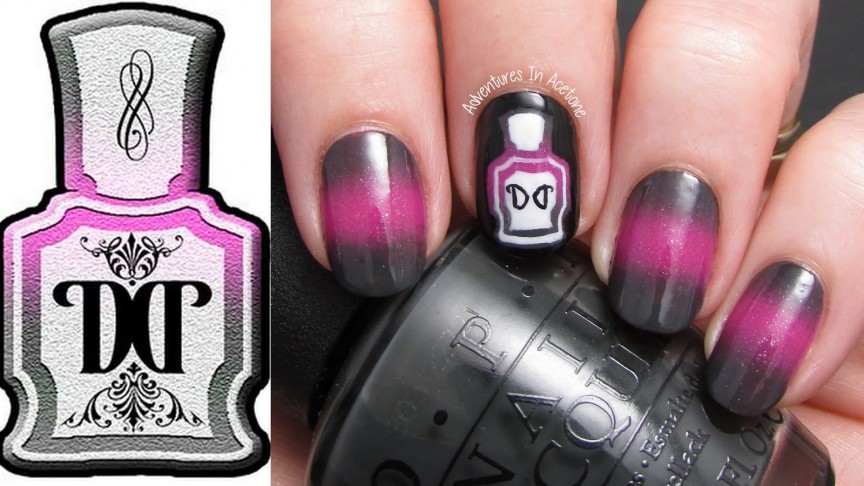
Hello, readers! It’s nail art week with The Digit-al Dozen and the theme this month is “brands.” I’ve decided to start off the week with the logo for The Digit-al Dozen! We have a fabulous image for our blog and various social media pages, thanks to Missy of Gnarly Gnails! It is a bottle of polish with a gorgeous gradient, so it was a no brainer for me!
First, I did a gradient on my nails with OPI Nein! Nein! Nein! Ok Fine! and Essie The Girls Are Out. For my accent nail, I then painted the polish bottle outline in black, and filled in the outside so the bottle of polish with a gradient was left in the middle. White and black cremes were used to add some more detail to the bottle. I wimped out and skipped the rest of the gorgeous details on the logo, but I think it’s close enough.
I can’t wait to show you the rest of the designs for this week! Thanks so much for reading!
If you enjoyed this post, please Sign Up for email updates and you will have the latest news, reviews, nail art, and tutorials delivered right to your inbox! Never miss a post from Adventures In Acetone again. Thank you so much for reading.
– Let’s paint something amazing! –


Comments
this is soooooo brilliant 🙂
I love this! The gradient effect is stunning!
So awesome!
I love this gradient effect, you picked the perfect colours, I am going to have to practice x
Deborah
moonstoneandmay.blogspot.co.uk
So creative….you did a fabulous job!
What a gradient!!
Yes, we are a brand! This is amazing – well executed too!
A perfect recreation of our logo!
beautiful!
Ah-mazing! Just gorgeous and brilliant! Love it!
This is FLAWLESS! Love it!
girl!
this is KILLER! i love it so much!!
Holy crap this is SO STINKIN' COOL! What a great idea, too 😀 I love these!!